
Cover Photo? No, Maybe, Done.

In the world of aerospace marketing, air-to-air images are often the default for magazine covers. Providing those images to magazines is one of the best bargains for a marketer (here's an article about that), but what if you don't have the budget or time for an air-to-air shoot? What if you must shoot from the ground?
It helps if the subject of the photograph is inherently dynamic, like a fast jet, but fast jets sitting on the ramp can be rendered dully while a wood-and-fabric biplane sitting on the grass can, through the photographic arts, be rendered as an eye-catching siren.
I present the tale of two aircraft photos, representing ones you might have the need and opportunity to create. A jet that's not even sitting on the ramp, but traveling about 140 knots, and a biplane sitting on grass. What features or factors would recommend each for or against a cover position?
This MD82 photo as a cover? Umm…no.
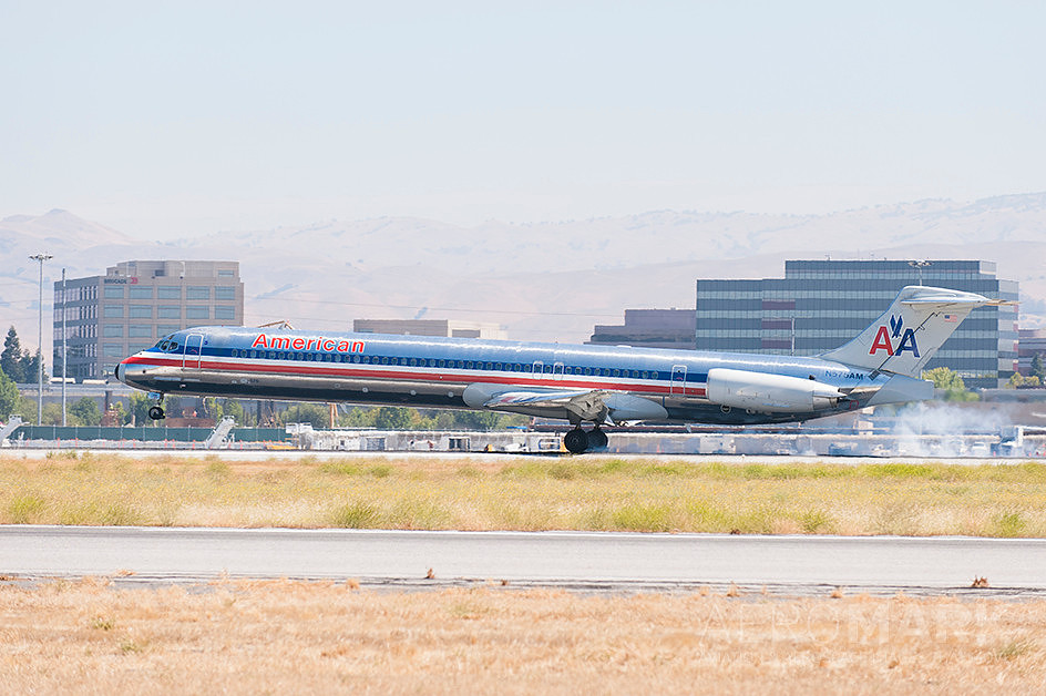

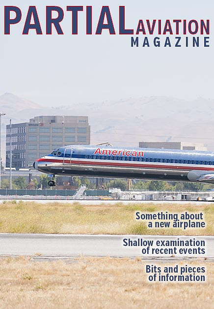
First, of course, this is a majorly horizontal image. The aircraft is very wide in the frame. Cropping to fit the cover of a magazine would excise most of the aircraft and leave swaths of uninteresting background. Admittedly, that would provide plenty of space for the flag (often mislabeled as the masthead) and cover lines (text), but it would be more space than needed.
The lighting is fair. There’s plenty of it, so everything is clear, but it’s mid-day, not a sought-after hour because of the generally harsh nature of that overhead sun, though the evident haze softens that harshness and pales the background, allowing us to better focus on the subject. A good news/bad news situation. But photographed from the side the fuselage appears as a simple tube visually broken only by the vertical stabilizer and landing gear. The wings and horizontal stabilizers have no dimension from this angle; the engine is its own tube but doesn’t otherwise relieve the simple profile of the airliner.
The nose gear is still in the air, which is a plus, and the smoke trailing the main gear indicates they are just touching down. So, there is some actual action but the side-view composition mutes much of its potential. There are too many factors working against this as a truly effective cover shot. See?
How about a Dornier Bü 133? Probably.
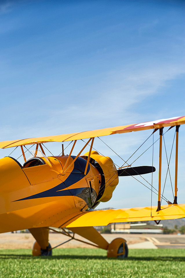
The photo is tall, so step one — check. There’s plenty of sky above the upper wing to fit the magazine’s flag, and room in the sky for those cover lines. So far so good, at least from a technical standpoint.
Yellow airplane against blue sky? That's some eye-catching color right there! The lighting is great, with perhaps just a touch of high cloudiness to soften that direct sun. Having the sun come from the side, too, rather than from behind the photographer, gives more dimension to the shapes.
And there are more shapes. The fuselage bursts in from the side, but we're not looking at the aircraft directly from the side. The engine has bulges, the livery is dynamic and, in typical biplane construction, struts and wires and tires, oh my! Lots going on, though the Dornier is going nowhere.
A feature of the image that is not obvious, except when you look for it, is the focus. Notice how the struts and wires are in focus, from near to far. The fuselage from the cockpit to the engine, that's all in focus too. Yet, the landing gear is not in focus, even though it certainly is at a distance somewhere in the range of those other elements. My technique? I used a perspective control, or tilt-shift, lens to tilt the, what I call, slab of focus so the struts and fuselage, etc., were within that slab. If something is not in that slab, it's not in focus. Doing so achieved two goals — all of that busy wing structure stayed crisp and eye-catching, along with cockpit and engine, while the foreground grass and background buildings went blurry. We know what those blurry things are, but our eyes are not drawn to them. It's a great technique, though it requires special equipment and the time to use it (it's a little bit tricky).
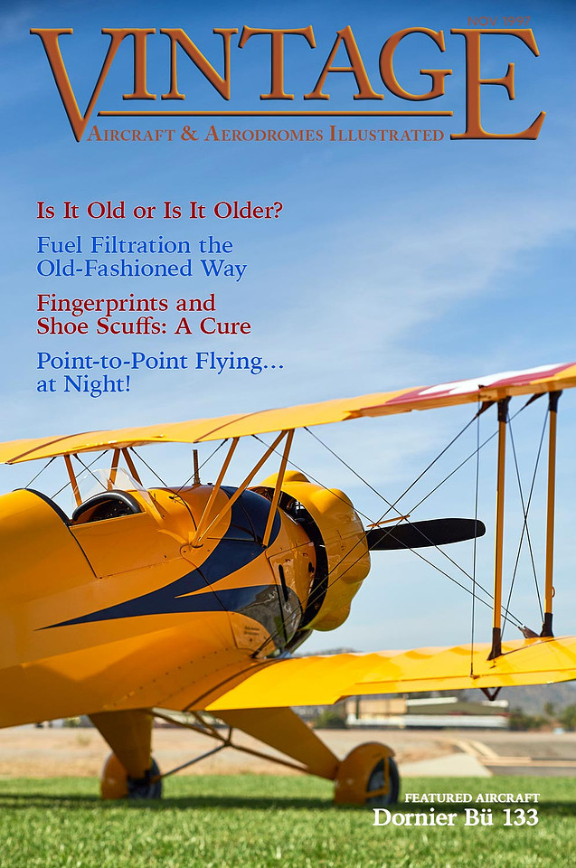
Put that bold image into a cover position and here's what you might get.
Possibilities
To illustrate a solution to the challenge of photographing a jet from the ground, I've put together this little number.
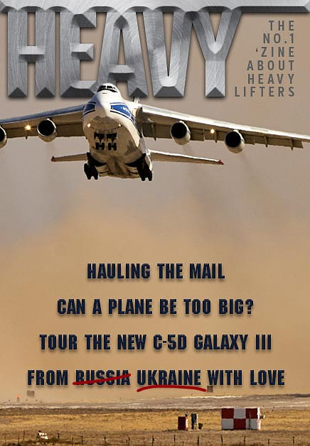
I was actually working on an unrelated long-term photography project for a city when I noticed this Antonov AN-124 warming up at the far end of the runways (someone later told me they need to get those engines up to temp and dialed in, or something like that, before releasing the brakes). I waited, long lens in hand, to capture a series of it rolling toward, then rising over, me. It came, I pressed the shutter release several times, and off it went (with one of its main landing gear bogies never fulling retracting into the fuselage for as long as I could see it!).
If this is your situation — you on the ground, the aircraft taking off — being in its flight path is a good place to be. Especially as it rises, vertical compositions make more sense and, especially with jets, you can use a fast shutter speed to get the sharp shots.
As for the "both of you are on the ground" scenario, with time and motivation you might try something like this.
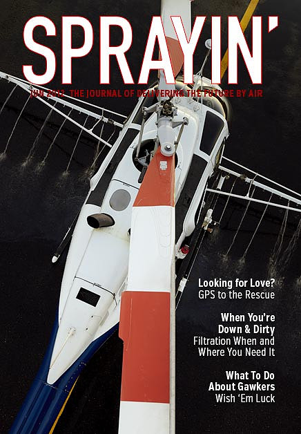
The operator rented a cherry picker and, when the lighting was right (and the ramp was wetted down), they turned on the spray pumps and I made the images. It's an unusual angle from which to see any aircraft, including this Bell 206. Graphically, the fuselage runs diagonally across the frame while the blades were positioned to run vertically. The water spray gives even this, essentially, static shot some action, while wetting down the underlying asphalt kept its texture and, I'm sure, bits of dirt and other distracting tidbits from, well, from distracting.
The ringer — K-MAX with Firemax tank (and a surprise or two)
So, here's an easy question to answer: would this photo of a K-MAX be suitable for a cover?
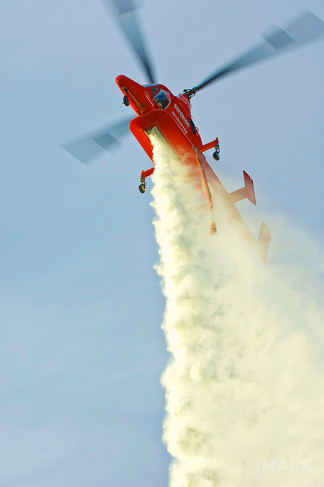
I sure hope your answer was "yes," otherwise I've not done a very good job, have I? Dynamic action and a matching composition. Good color and sharpness. Shot vertically. Plenty of room for text. It has, like, everything going for it.
Is that just my opinion? No. Rotor & Wing thought so too, and the image was the cover of the August 2005 edition of the magazine.
Or at least I thought it was. When I first wrote this article, in 2015, I thought they had used this photo. I didn't have my copy of the magazine, ten years after the fact, but I recall having a discussion, back and forth with the publisher, about them wanting this composition, from among those I shot, but with more sky above the aircraft — apparently it was too high in the frame and would interfere with the flag and other header materials. Well, I couldn't find an image with more sky, but it's a great shot and I presumed they just went with it.
Nope.
They actually chose a different image and, get this — they had to add blades and sky! See?
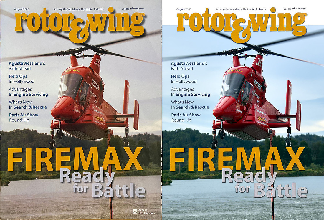
On the left is a photo of the cover, as printed. On the right is my version where, for the purposes of this article, I Photoshopped the original photo into place, including the lack of sky/rotor blade where you see that lack. But wait! It gets even more confusing (and then, spoiler, I figure it out).
Here is the cover, recreated using the photo I thought they had used.
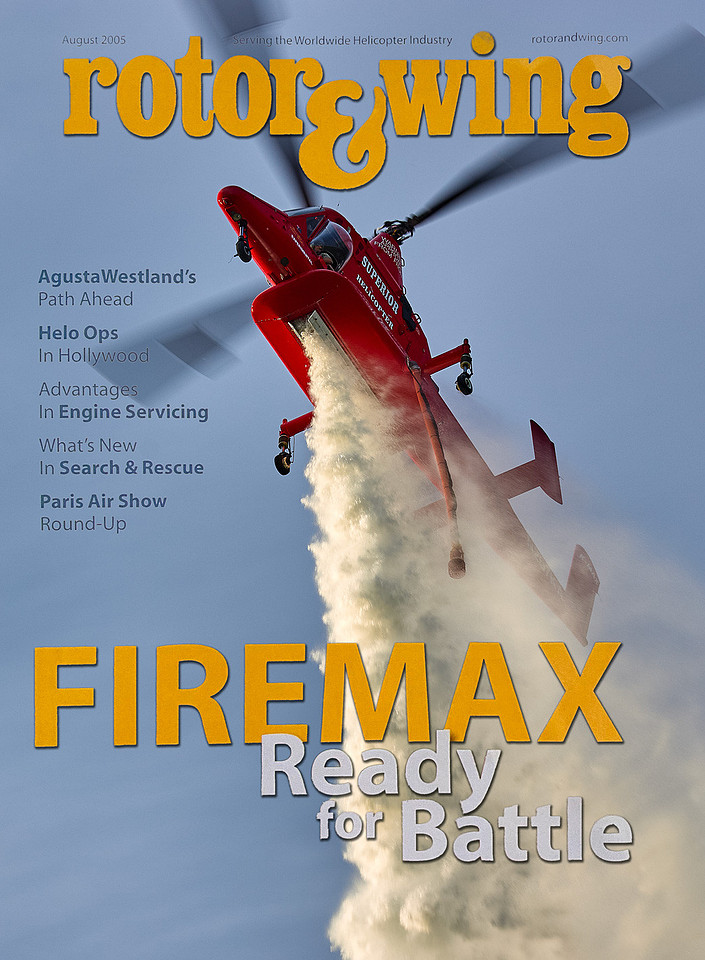
It's magnificent! And it doesn't need any more sky or blades at the top. What it the world could have caused the magazine to use the other, less exciting, photo? My guess is it was the brand-new ad that appeared on the other side of the cover, what's called the inside front cover.
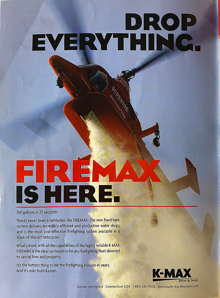
This ad. You see, not only was I the photographer, I was also the designer of this ad for my agency's client, Kaman, and it totally makes sense for the magazine to not use the same photo as their client is using in that client's new ad.
So, the cover had to settle for something not quite as dynamic, while the ad got the prime shot. I'm going to declare good jobs all around.
And while I'm at this, I might as well continue on the topic of the ad, because slipped into my copy of the magazine (which I rediscovered only recently) I found a report on how all of the ads in this issue of Rotor & Wing performed. The number one ad, in terms of respondents to the survey reporting they saw, read, and found an ad interesting? This one right here.